Studying is something I can certainly say I have done....for years. Kindergarten through twelfth grade makes 13 years of studying, then add in nearly 14 years of university, for a grand total of about 27 years of study. What is studying, then? Is it just learning facts or theories and being able to repeat them or apply them in tests and exams? Does studying go beyond that which we learn in school? Surely it should apply to anything we learn in earnest, whether that subject is a traditional school subject, or whether it's something less traditional and more practical or artistic.
After having come to the conclusion that my space was certainly one for study, and that it was also one in which things happened that one might call art, I decided perhaps it was not too pretentious, and that I was indeed permitted to call my space a studio. It is not, at present, a finished studio. In fact, it's quite far from that. That said, it's the place to which I retreat when I need "down time" from the chaos of working on the other parts of the house. It's a little bit of solace in the run of a day. And now, it needs colour.
I've been spending some time sitting on my chair, just staring at my space. I am one of those people who feels strongly affected by colours in a room. I am not fond of white or off-white walls. They seem cold and uninspiring to me. For others, they can be calming and pleasant, but for me, they are stifling. I need to feel the energy and warmth that colours bring to my world. With that in mind, I've been trying to sort out how to proceed with the decorating of this area I call my studio.
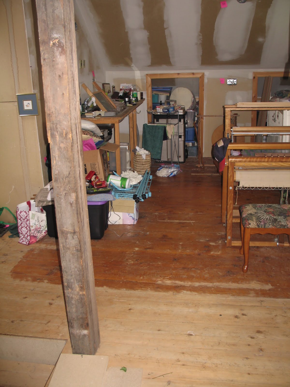
I have two primary spaces that make up this area. One is the spinning and sewing area, and the other shall be the felting, weaving, and "other stuff" area.
This is the spinning area. I love the sloped ceiling and the old hickory beam in the centre of the ceiling. The window has a gorgeous view of the land surrounding me and I face it when I spin. It's a bit chaotic at the moment because we haven't got all our closet space available yet so some extra stuff is being stored here for the time being. On either side of the window, there are "cubby holes" about 3 feet to either side that will hold storage totes or boxes. They also have the sloping ceilings.


This is a better view of the wall on the right hand side of the first picture. As you can see, I have fibre storage cubbies for spinning fibre, also destined for painting. You may also note that I seem to need more storage!

On the wall opposite the sink I have made (perhaps creative?!) use of a baby crib left behind by the previous owner. I was ready to throw it out when it occurred to me that it would hold a lot of fibre and yarn!


These colours really speak to me the most. I love the vibrancy of the greens juxtaposed with the deep, velvety purples. I think this is likely to end up being an overall theme. Since the rooms have so many wall surfaces - little sections of sloping ceiling, small nooks and areas with strange angles, I'd like to combine multiple greens in this family and do different parts of the walls in different greens. I'm thinking I might draw some large purple and green spirals on the walls in strategic places. Spirals exist widely in nature, showing up in diverse places such as seashells and flowers. Triple spirals are also used in Celtic art, sometimes representing the Irish sea deity Manannan, sometimes the Pagan triple goddesses, and sometimes the three realms of sea, land and sky. These images are attractive to me and I'd like to incorporate triple spirals into my studio space.


I know I have a lot of creative minds who read this blog, so maybe some of you will have ideas or thoughts on how to proceed. I'm open to most ideas at this point! Please don't suggest painting the walls black (or white) because I'm not doing that, but maybe some of you will have ideas I haven't thought about. The main focus points are: energy, vibrancy, life, creativity, imagination, and sheep!
14 comments:
Aaaaah, you and the publicist would get on just fine. She has painted her yurt in many of those same colors; her kitchen is cherry red, her bedroom is sunny yellow, her bathroom is raspberry pink and her craft room in a rather limey avocado. The only "neutral" color is the blue/silver/grey in the living/dining area.
She is awash in color. And she loves it.
Good for you. Go for it. Color is happy
Look at all those fun things ready to turn into projects! My lady would love a studio! Her craft junk is everywhere! She has a closet stuffed with fabric and yarn. She always grumbles and mumbles when she tries to find anything in there and it all falls down on top of her. Tee hee hee. I can't wait to see what colors you choose for your space, dear Claire!
I love the greens and purples together, to me, much for energetic that the roses, etc. Green is growth and purple is royalty...in my mind.
Maybe choose two or three colors and buy the small cans to try the different colors. See what makes you feel good, after all it is your studio.
Can't wait to see what you choose...and I love painted floors.
I love the greens and purples, and you could even incorporate vines and grapes since you are a winery.
Teresa
I was going t suggest a lavender or lilac. A nice color, but not one that will darken the room in winter, or make it feel small. Maybe that would serve as a good background to some of your other colors and images.
I don't know if you've chosen colors before, but the first lesson I learned was to find the color chip you like, then go at least three shades lighter. Cause the color gets so much more intense when you cover a whole wall with it!
So yeah, I'd also suggest getting some sample sizes to see what they look like sur place.
I just have one thing to say...this being the technical side of painting. If you pick red or colours close to it. Make sure that you prime grey. That's what I do for a living. I work in the paint dept. I'm your local paint hooker...at your service.
Ooo. A lovely space! Somehow I see maybe some beautiful vintage floral wallpaper on at least parts of those slanting ceiling thingies (how technical is that?) I too, love ocean colors and I also like that one picture with the purples and greens cards. Kind of reminds me of violets in spring. You could paint the bars of the old crib in alternating colors that make up your color scheme and the back and front maybe wood tone to match the hickory parts in the room? Thoughts anyway. And maybe an image of Cerridwen with her cauldron or the triple goddess? So many possibilities, can't wait to see what you do!
That's most excellent.
I love the green and purple combos. It reminds me of vineyards, and maybe sheep grazing amoungs the vines.
so many choices, so many opinions! and so much fun deciding...what a charming little space... might I have a bit of "studio envy"?
Oh, wow, Claire! You have so many luscious ideas...and I know you'll find the energy; you always do. Great idea on the crib. I love teal, but you have received some very good suggestions and tips on painting. My sister recently went through this - painted a small rectangle in the color she wanted in a space where a picture had hung so she could hide it until she was ready to paint the entire room. And, yes, the color darkened and she ended up getting a much lighter shade.
Nancy, left behind in Iowa
Claire,just wanted to let you know I posted new pics of the lambs.They are ready anytime you are.
They are looking so much like their Cotswold sire and are so curious and friendly.
I love your blog! I nominated you for a blog game!
http://lucky13goatranch.blogspot.com/2011/08/special-post.html
Tayet
LOVE THE GREENS AND PURPLES...LOOKS LIKE HEAVEN JUST THE WAY IT IS! MY EYE WAS DRAWN IN THE FIRST PICTURE TO THE FLORAL PIECE (?) ON THE WALL...I LIKE THAT. THE BABY CRIB IS AWESOME TOO!
Post a Comment